Improving Candlesticks Chart
One of the bureau homeworks
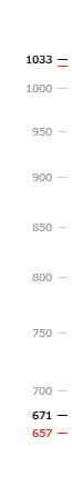
Candlesticks chart is a special type of chart, where each point shows not one but four values (open, close, minimum and maximum) during a certain period.

If a value decreased, the body of the candle is black; if increased, it is white

The beginning and ending values may match the maximal or minimal values and they also may be equal
The candlesticks are often used for depicting the market quotations of shares, prices, commodities, etc. Such charts serve as a convenient tool of graphic market analysis: the study of candlesticks allows to identify trends and to forecast further market fluctuations.
My idea is built around the concept that the color column should be replaced with offset center portion. A shift to the left would signify a decrease in the price (corresponding to the black column) and a shift to the right — to an increase in price (corresponding to the white column, respectively).

A slightly reworked example of the candlestick chart from Wikipedia and my version
My chart contains the same amount of information as the original version, whereas it lacks odd uninformative elements, has less graphic noise and unnecessary ink. Any combination of candles on the chart can be highlighted without any background boxes or call-out notes by just thickening the line.
Another example: a gold price fluctuation chart with Bollinger bands (20.2). Source: www.stockcharts.com.